Did you know that different paint colors can bring out different moods in customers? It’s true, and one of the main reasons it is vital to choose store colors that relate to your brand. Retail store colors can subtly share a variety of messages––and a message your customers will definitely pick up. In fact, “85% of shoppers place color as a primary reason for why they buy a particular product,” according to KISSmetrics.
Beyond current trends, it’s important to consider your customers, your product, your brand, and some tried and true color concepts. There’s not a one-size-fits-all approach here, the best paint colors for a retail store are dependent on that store. Here are some ideas to get you started:
How do I Choose a Store Color Scheme?
There are a few ways to approach the process of finding the best paint color for your retail store. Start by choosing a theme that positively relates to your business and products. For example, if your company deals with the ocean or the beach in some way, you can create the feeling of being there by using colors that remind your customers of the sand, blue water, and sunshine. Most people associate the beach with fun and relaxation, which may, in turn, make them want to linger and shop a little longer.
Or if you have a wilderness clothing company, choosing earthy colors and tones will help immerse the customer into the theme. Try Sherwin Williams’ Ryegrass Green (SW6423) or Sherwin Williams’ Brainstorm Bronze (SW7033) for a light but impactful brown. They may be more inclined to browse around if the atmosphere is something they enjoy––like the great outdoors.
What Do You Want the Mood to Be?
You want your customers to feel welcomed and invited into your retail space. Determine what mood you want them to be in while they’re shopping with you. Cool colors like green and blue (think Benjamin Moore Waterfall 2050-50) create a calming effect, while warm colors like oranges and browns feel reassuring.
Bright or bold colors will grab your customers’ attention, so if there are certain products you want to showcase, include vibrant colors in your display. Red is associated with traffic lights and emergency vehicles, and yellow is the color first perceived by the retina. Both colors will make your customers stop and pay attention.
What are Your Logo Colors?
Using the colors of your logo in your store’s design helps to build brand awareness. Thinking about some of your favorite brands, you probably think of their logo and their brand colors first. Consumers need something with which to associate your business. Colors that stand out to them will help them remember your brand, and the experience they’ve had with you.
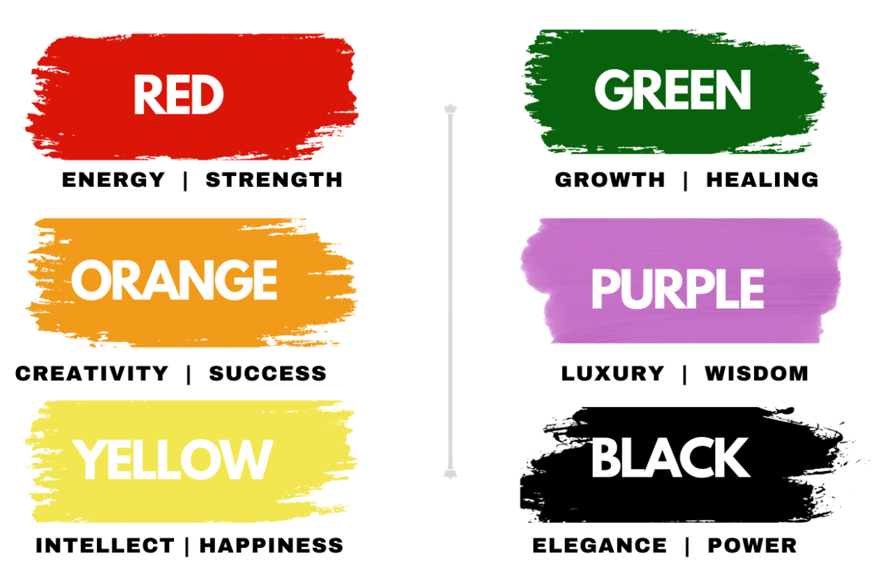
What do Different Paint Colors Mean?

The merchandise is the most important part of your retail store. You don’t want the color of your walls to make your product disappear. Always opt for shades on the subtle side to let your products do the talking. Here are other color associations from ColorPsychology.org to keep in mind
- Red – energy, strength, power, passion
- Orange – joy, enthusiasm, happiness, creativity, success, stimulation
- Yellow – joy, happiness, intellect, energy,
- Green – nature, growth, harmony, freshness, safety, healing, tranquility, calmness
- Purple – power, luxury, extravagance, wisdom, creativity, magic, mystery
- Black – power, elegance, formality
So, before you begin your next painting project, you’ll probably want to think about how the colors you choose will affect your customers (and even your employees!) and the colors that are best for your product and your brand.

